CASE STUDY
Femtech Design System
Introducing a polished design system tailored to elevate the experience of a new breast aesthetic procedure website in the Femtech market.

Introduction
As cutting-edge medical technologies rapidly advance, each product launch seeks to claim a leading position in market innovation. In the field of breast aesthetics, continual introduction of new procedures is commonplace, emphasizing the importance of staying current with the latest trends.
This design system was required by the launch of a new procedure in Femtech, a fast growing sector focused on women’s health in healthcare technology. This breakthrough addresses specific breast augmentation needs, presenting an innovative, minimally invasive procedure that ensures a uniquely tailored experience in breast aesthetics, initially targeting the Asian female market.
ROLE
As a UI designer, I collaborated closely with the company graphic design team. Our approach involved utilizing the brand guidelines of the new product as a foundation to establish specific web-oriented design guidelines.
tIMEFRAME
Jan - Mar 2023
lOCATION
Costa Rica
Client
Global medical technology company focused on women’s health and wellness
Proyect type
Commercial project
Tools
Adobe Xd, Illustrator, WebAIM: Contrast Checker
gOAL
The newly developed design system aims to capture the essence of the emerging brand, delivering not just a premium and personalized experience but also embodying the characteristics of a high-end medical aesthetics procedure.
This system ensures consistency, scalability, and a unique visual identity that distinguishes our offering from competitors, promising a cohesive and visually captivating user experience.
chALLENGE
Preserve the distinctive visual identity and core essence of the product while accommodating the evolution and growth of the digital product according to the product needs within the emerging market.
Additionally, provide the client with the necessary tools to guarantee a consistent, trustworthy, and unified digital experience with maximum flexibility and minimum effort.
Design process
In the research phase, an understanding of stakeholders and project requirements was gathered. Later, brand guidelines were analyzed and accessibility standards were meticulously considered.
Once the requirements were met, the mid fidelity wireframes were designed. Then proceed with the production of the design system as such, after having defined the brand guidelines and color accessibility.
The process is finalized by applying the design system in the wireframes, it is important to highlight that the process does not end there, in some occasions it was necessary to reiterate and produce more components due to new requirements.
User Experience
pRODUCTION
Testing and iteration
requirements anD Wireframes
To determine the components to be designed, I used the mid-fidelity wireframes I had been previously working on for the stakeholders. Due to the project’s launch deadline, it was a priority to make as much progress as possible with the wireframes while the graphic design team finished setting the brand guidelines, as it was the starting point to begin with the design system.
At this stage, the mid-fidelity wireframes summarize the requirements and features needed in approximately 15 screens.

Accesibility
Once the brand guidelines were ready, we checked that the main color of the brand was accessible in a Contrast Checker. It did not pass most of the WCAG levels as foreground (left), so we played with the color brightness until we got one that met all WCAG levels (right).

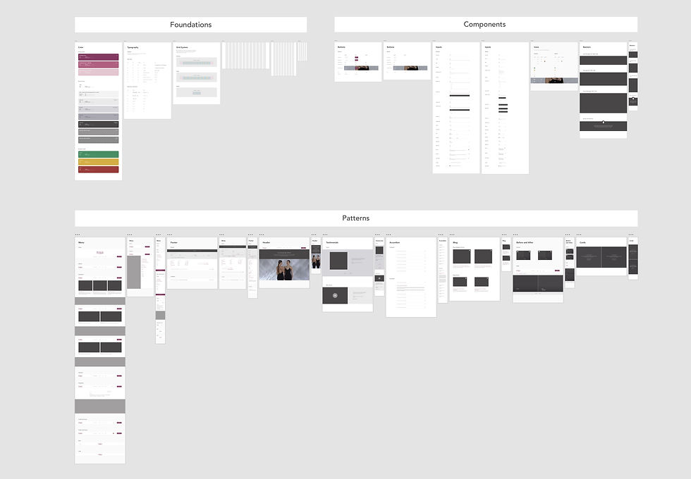
design system
The design system was divided by: foundations (color, typography, grid system), components (buttons, inputs, icons, banners) and patterns (menu, footer, header, testimonials, accordion, blog, before and after, cards).
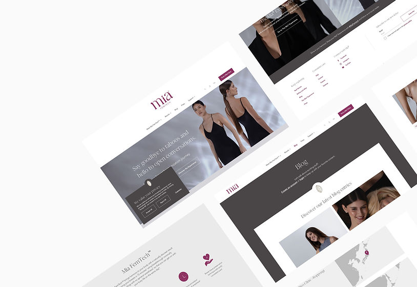
Final design
The design system ultimately results in over 50 live pages, guaranteeing an exceptional user experience across both desktop and mobile platforms. It establishes a foundation for consistency and scalability, facilitating seamless adaptation to future changes and upgrades.
Learning & takeaways
-
Creating and managing design system at scale
-
Balancing pace and perfection
-
Receiving feedback and iterating