CASE STUDY
Fresh market ar web app
User experience and interface design of a web application to reduce interactions with objects and third parties when shopping in convenience stores.

Introduction
This project arises in the context of the global pandemic caused by the COVID-19 virus in 2019, where the fear of contact grew enormously, causing in parallel, an increase of different digital solutions in everyday life, even affecting the way of buying and selling.
Specifically in the food sector, what was once a mere formality of buying and selling food, now, with the help of technology, it has elevated into an experience.It’s not just about transactions anymore; it’s about creating an engaging experience, both in physical and online stores.
Because of this shift, more tech-savvy and modern shopping concepts have emerged. This presents a unique potential and opportunity to introduce a new shopping concept to the domestic market, since at the moment, there is no similar offer.
ROLE
UX/UI Designer. I was in charge from setting the protect strategy, research for data and insights, to wireframing, and creating the visual design.
tIMEFRAME
Ago - Jan 2020 (20 weeks)
lOCATION
Costa Rica
Client
Fresh Market
Proyect type
Conceptual project
Tools
Adobe Xd, Illustrator, Photoshop, After Effects
gOAL
Design and validate a web application interface to reduce interactions and limit physical contact with objects, public surfaces and third parties when shopping in convenience stores, in order to:
- Protect consumer health,
- Prevent the spread of disease,
- Automate processes and make them more efficient, and
- Offer the market a new alternative and fun shopping experience through new technologies, such as augmented reality.
chALLENGE
Due to the health measures adopted in the country, such as social distancing, it may affect user testing and data collection, so it is important to rely on online tools.
Also, as the platform is brand new, the possible functionalities it could have are very broad. It is necessary to delimit very well the needs of the users to avoid overloading and increasing the complexity of the tool, as well as minimizing as much as possible the tendency to error and learning curve.
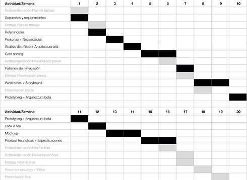
Design process
The methodology used is based on the one proposed by PhD. professor Franklin Hernández-Castro in his book ‘Metodología para el análisis y diseño de aplicaciones (usability cookbook)’ (2016).
However, the methodology could be modified and adapted according to my criteria and the requirements of the project, since not every project is the same.
The methodology was divided into 5 phases shown below and was broken down in a timeline of approximately 20 weeks.
requirements anD constraints
Research is conducted through initial interviews, observation and digital surveys to potential convenience stores users and also, stakeholders.
Based on the insights obtained from these initial surveys, the worst-case scenario was mapped in a Customer Journey Map, from the moment the user enters the store until they pay for the purchase.
This easily identified the pain points in the experience that present frustrations, or rather, opportunities for improvement.

Taking that into consideration, the list of functionalities that the tool will have, is synthesized as a first architectural sketch.
Constraints
Flattening the learning curve as the idea is to implement new technologies.
Delimit well the needs of the users in order not to overload and increase the complexity of the tools.
User testing and data collection is done with remote tools to respect social distancing.
Benchmarking analysis
An investigation of existing applications that meet similar needs related to the project is carried out in order to analyze how they solved their functionalities and visuals.
Six applications were analyzed and for each of them a brief description was written and their operation, pros, cons and design patterns were identified.
Reference analysis

Amazon Go Grocery
Technology analysis
Since it is of interest to innovate with the technology to be used in the tool, a technology assessment was also performed to determine which technology was possible to implement in this new tool, in a short time and at a low cost, without abruptly disrupting the existing operational system of the stores. These were the key findings:

Self checkout and digital cart functionalities are discarded since the cost of the investment-benefit offered by the proposed possibilities is not positive, including the high possibility of theft.
1 Use of cameras, Computer Vision and sensors, like Amazon Go Grocery and Zippin
2 use of barcodes to add products to cart, payment with NFC sensor that opens doors/barriers at checkout
3 Implementation of RFID sensors on all the products and detector bars at the entrance, like any clothes store

For the user indoor positioning system, the simplest and most inexpensive option to implement are visual markers. They are placed on the floor or walls and each one of thems stores their exact location in a database. When the user scan it, their exact coordinates are read in the real world to start searching for a products

The tool should be a web because it is easy to access while on-site at the store, and to avoid downloading a heavy native application. Given that it is intended to use augmented reality, which tends to make the application heavier.

The idea is to place the bar code of each product next to the price to read additional information that is normally found on the back of the product and thus minimize contact with the product.

This project depended heavily on the technologies available in the market, so this technological analysis was a crucial moment in the decision making process.
Benchmarketing chart
A comparison was made between the references analyzed to identify the characteristics and design patterns in common.
Most important design patterns, related to locate the products
"Nice to have's"

User analysis
Three Personas were extablished: expert, intermediate and beginner user, depending on their tech-savvy, since the idea is to introduce a new purchasing technology to the market. The Personas are captured in a template.

User expert
Needs table
A table was used to define which needs the tool satisfies for each Person, respectively. These needs are understood as scenarios of uses. It can be noted that there are many joint needs and a few specific ones for each user.

Traffic analysis
A percentage of use of the tool was assigned to each Persona. It was defined that the largest number of users who would use this web app would be among the expert and intermediate users, since the tool is aimed at a young adult audience.
At the same time, for each Person, a percentage of frequency is assigned to each need. The ten most important needs were selected from the table above, which translate into the most important needs to be met: minimizing contact, locating products, viewing promotions, offers and product information.

Pareto chart
The results of the Traffic Analysis were taken and placed in a Pareto Chart to identify which needs made up the 80% of it, so the efforts should concentrate on meeting them
The 80% was made up by:
- Minimize contact
- Locate product
- See promotions and offers

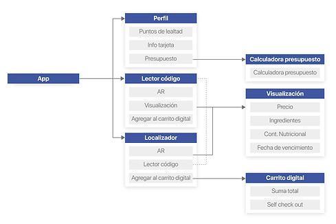
Alpha architecture
The analysis and results of the user analysis are taken into account and the first proposal of navigation, organization and hierarchy of the contents is generated under the name of alpha architecture.

Card sorting
The terms and concepts were extracted from the alpha architecture and placed on individual cards to check the nomenclature and structure of the initial proposed architecture.
Open card sorting was used, where the testers can freely group and order the cards, as well as add or suggest new terms, and not necessarily use all the cards. A total of 38 cards were used, with some terms repeated and others abbreviated.
Then a dendogram was made, a graphical summary of the times that the terms were grouped together by the testers.

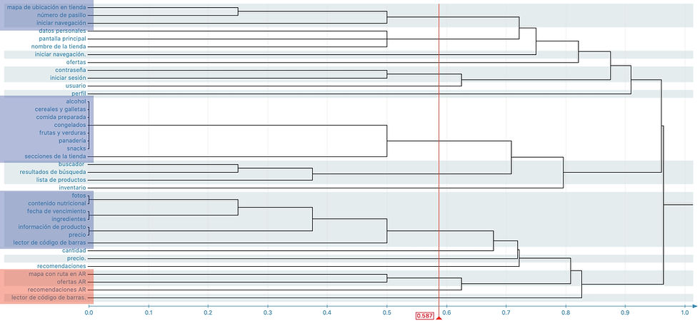
Key findings
All the cards with the nomenclature "AR" at the end were grouped together because of the similarity of the term, but the English abbreviation "AR" was not really recognized.
It should be taken into account that not all the target audience speaks English to avoid using anglicisms that might not be accessible for all.
The cards related to the search for a product and the start of the navigation route with augmented reality are confusing. It is noted that this section should be restructured in the architecture to make it more intuitive.
Navigation patterns
The alpha architecture was redesigned with the findings found in the card sorting. The main changes were the following:
- There is an onboarding at the beginning of the experience that explains the main features of the platform.
- The user is offered the option to select the store where he/she wants to view the information and select purchase preferences according to his/her buyer profile, so that the recommendations and offers are aligned to his/her habits and tastes.
- Pop ups are created to alert the user of general communications, product recommendations or new offers.
- Searches are limited to one product at a time.

Before
The navigation patterns that users must take to perform the most important tasks, previously defined in the Pareto, are tested.
The number of clicks the users make to reach these priority tasks is measured to check if they are met in as few clicks as possible.
Read barcode to visualize product information
Wireframes
The first sketches of the main screens are elaborated, first the low fidelity wireframes by hand and then the digital mid fidelity wireframes.
Low fidelity wireframes
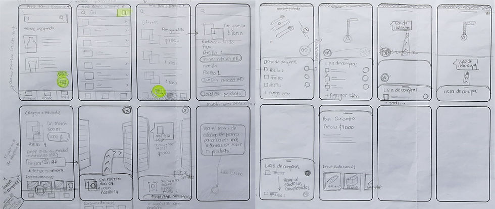
Mid fidelity wireframes

Prototyping
Tests were carried out with potential users using the mid fidelity wireframes. The objective is to determine if the position and distribution of the elements is correct and has a low learning curve. Also to test navigation, alpha architecture, design patterns, content hierarchy and reading sequence.
The following six are the tasks the users had to perform. In these tasks, specific doubts left over from previous stages were evacuated and the general acceptance of the tool was consulted.

Task 1: "You came to Fresh Market and noticed the new web application. Use for the first time the tool offered by the store."
Key findings
Task 1:
-
Improve Shopping Preferences screen, lower the cognitive load wit support of the look and feel.
-
It is proposed to visualize the onboarding more than once, by means of a "Help" button in the Profile, where users can visualize again the features and operation of the features and operation of the application. This functionality is important so that begginer users who are not so tech savvy can refer to this information.
-
Make it clearer that the application uses, and in what way, augmented reality, either by means of graphical elements or explanatory text.
-
Some users mention the possibility of choosing the the store in which they want to display information or in which they are which one is shopping, at the beginning of the experience.
Task 2:
-
Make it clear that locating the product is with augmented reality through ook and feel.
-
Give equal importance to the price of the offer and the products within the offer, as this is the first thing the user wants to see.
Task 3:
-
Detail the interaction with augmented reality when locating a product.
-
Add button to exit the augmented reality view and continue with the flow of use.
-
Add alert that the user arrived at the product location.
Task 4:
-
Point to remove the finder in the Profile section. The Finder is present in the Inventory and Offers sections
Task 5:
-
Evaluate whether to edit each section of the profile or leave the edit button global. Add demographic data, such as age.
Beta architecture
An improved architecture is generated and the errors and improvements found in the previous stages are corrected.
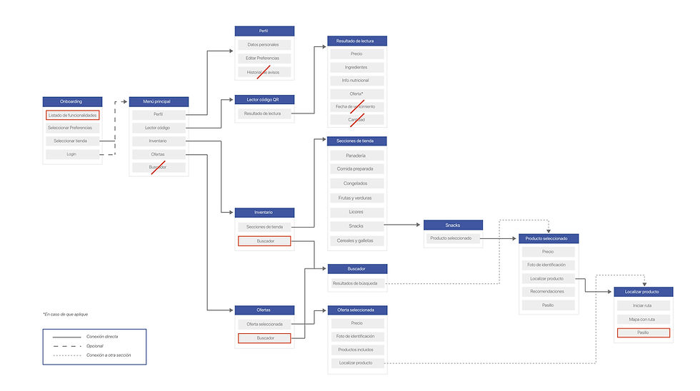
Major changes
-
The Search section has been removed and now the search bar is present only in the Inventory and Offers sections.
-
The possibility for the user to visualize the exact quantity of products in the Inventory section is eliminated.
-
The internal architecture of the Inventory section is not further developed as it is not the objective of the project.
-
The login is optional so the user after selecting a store, can access the information and experience of the application.
-
Pop up messages are displayed for recommendations, new products or general announcements/messages.
Look & feel
Fresh Market is considered as a potential buyer of this product, so its graphic line is used. In general terms, Fresh Market's graphic line is simple and clean, relying heavily on the use of green to semantically allude to freshness, nature, health and wellness.
All chromatic, typographic and iconographic decisions are based on the graphic material used by this convenience store in its social networks.
Typography

Chromatics

Iconography

Grafic elements

Mock up
A functional mockup is designed in which the previously defined look and feel is applied.

Heuristic testing
Scenarios and tasks that may have been left in doubt in the previous stages were selected. The look & feel, hierarchy and reading sequence were tested by techniques such as think aloud, video and observations.

Task 1: "You came to Fresh Market and noticed the new web application. Use for the first time the new tool offered by the store. Is the sequence of data and information collection in the onboarding logical?"

Task 2 had a 100% success rate.
Major changes
-
Task 1: Place the login after presenting the features of the application. features of the application. If the login is done, the other the rest of the data is requested and if not, when entering the the application the profile would be empty with the possibility of logging in possibility of logging in with some social network.
-
Task 3: Detail the interaction in augmented reality when locating a product. locating a product, as well as the hierarchy of information.
-
Task 4: Change the icon in the Code Reader section to a barcode icon to a barcode icon, and identify the sections faster. the sections more quickly.
-
Task 5: Disable the Locate Product button in the Inventory if the user is not in the store. Inventory, if the user is not in the store.
Final design
Take a closer look at the functional mockup meticulously designed in Adobe XD. Explore its features at your own pace or conveniently view it through the provided Adobe XD link for a detailed analysis.
Reflections
Design and validate a web application interface to reduce interactions and limit physical contact with objects, public surfaces and third parties when shopping in convenience stores, in order to:
- Protect consumer health,
- Prevent the spread of disease,
- Automate processes and make them more efficient, and
- Offer the market a new alternative and fun shopping experience through new technologies, such as augmented reality.
Recomendations/
project next steps
Due to the health measures adopted in the country, such as social distancing, it may affect user testing and data collection, so it is important to rely on online tools.
Also, as the platform is brand new, the possible functionalities it could have are very broad. It is necessary to delimit very well the needs of the users to avoid overloading and increasing the complexity of the tool, as well as minimizing as much as possible the tendency to error and learning curve.